Khanh Phong Design Studio Identity
An identity for a startup inspired by hieroglyphic Chinese characters
The startup is founded by a Vietnamese-born Chinese so that they want their identity has the touch of Chinese tradition. In the result, the concept gets inspired by the hieroglyphic Chinese. “Khanh Phong” means celebrating harvest that is a mutual wish for the company itself and their clients to succeed.
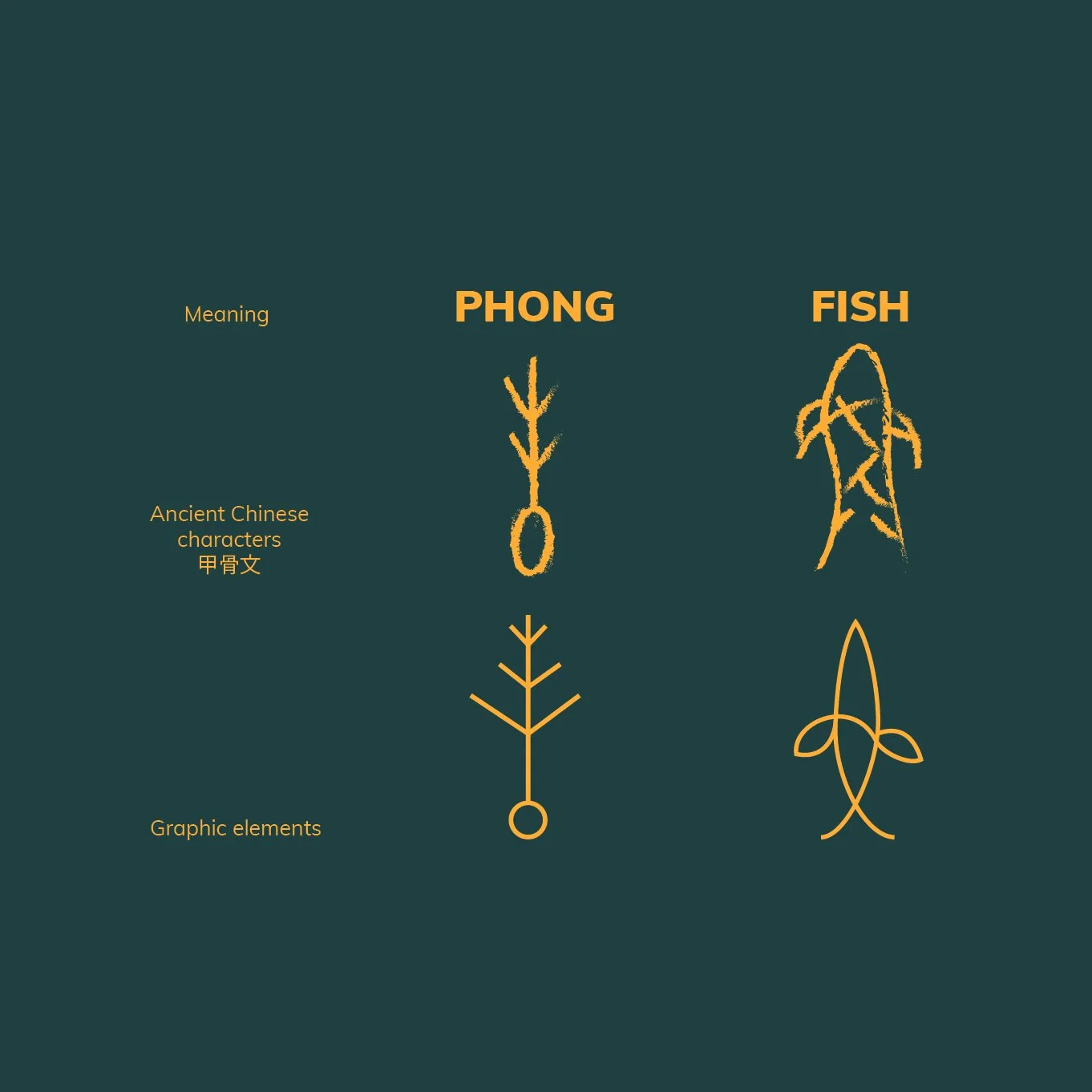
Inspiration from the ancient Chinese characters, the logo is combination from the Chinese word of ‘Phong’ and the of the word ‘Fish’. Although the fish doesn’t appear in the name but it always presents in the meaning because the Chinese usually use the image of fishes to represent surplus, plentifulness. In this regard, it completely matches the name. That’s a wish to succeed from the company to the client, a reminder for the company to spare no effort to help their client attain their goals.